Last Updated on December 5, 2023 by Leo Dias
Would you like to drive more traffic to your website? Who doesn’t want…
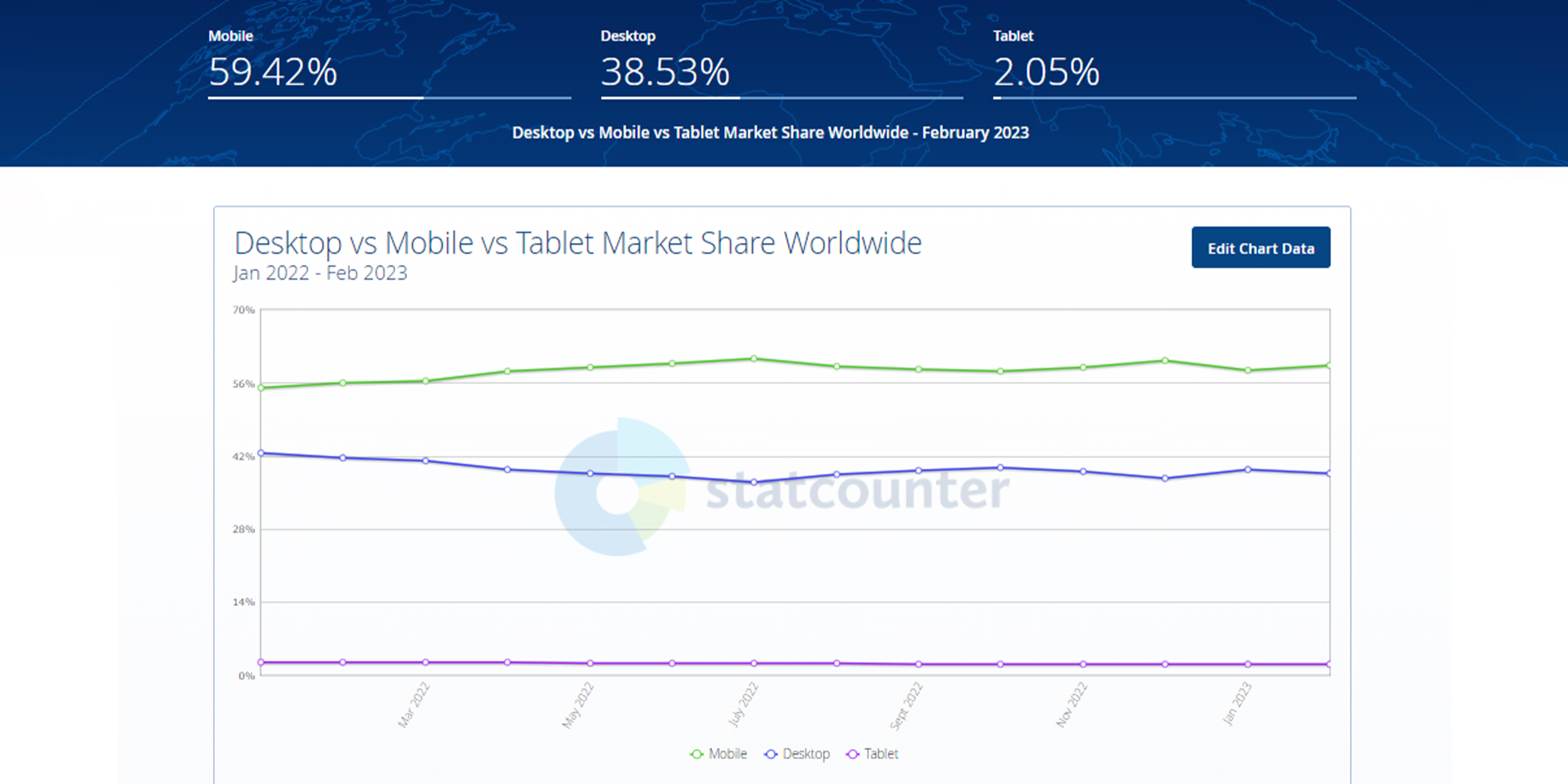
As per Statcounter Global Stats, over 60% of website visits now happen on mobile (versus 37% on desktop), a percentage that is still trending upward. With users now accessing information virtually anywhere, your website must deliver a seamless experience on all devices.
The solution? Responsive website design…
There’s a staggering growth of mobile devices like smartphones and tablets and mobile device usage via websites, apps, social media, and games. It is now essential that your business website must be mobile-friendly so that your targeted customers can easily browse and find information, regardless of what type of device (mobile, tablet, desktop, etc.) they are using.
Approximately 50% of all web traffic worldwide comes from mobile devices. Mobile traffic, excluding tablet traffic, accounted for 59.16 percent of all website traffic in the fourth quarter of 2022, consistently hovering around 50 percent.
Not to mention, to provide the most satisfying user experience, you have to consider tablets, 2-in-1 laptops, and different smartphone models with different screen dimensions when coming up with a web design that looks equally good on screens of all shapes and sizes.
|“Great Web Design without functionality is like a sports car with no engine” — Paul Cookson
Keep reading & we’ll walk you through a simple tactic to generate genuine traffic– A mobile responsive website. This blog simply elaborates on what is responsive website and why it is essential to growing your business.
What Is A Responsive Website?
Responsive website, aka. “Responsive Web Design—RWD” refers to a modern web design strategy that allows websites & pages to display on all types of devices & screen sizes by automatically adapting to the screen. It can be a desktop, laptop, tablet, smartphone, or even a smart TV. This positioned responsive design as a critical factor for the user experience and a ‘must have’ for online businesses.

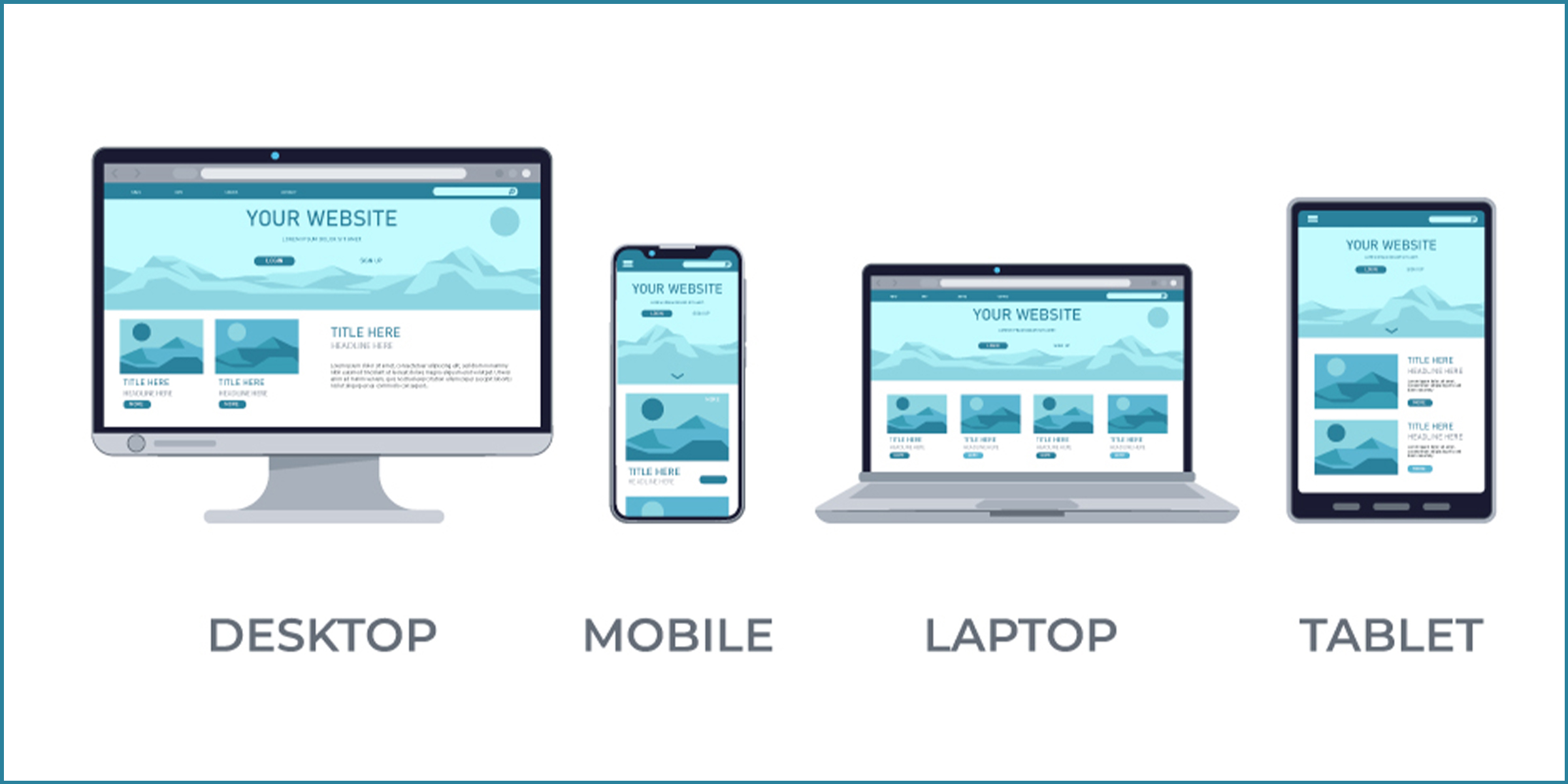
In short, responsive website design means that the elements on your website (i.e., texts, images, videos) automatically adjust according to what device it is being visited from. The resolution of everything from menus to images should change accordingly to give the best user experience, regardless of the device one uses.
Why Is Mobile Friendly Website Important?
1- Help You Increase Traffic To Your Website
According to reports from StatCounter & Statista, as of February 2023, 60.04% of all website traffic comes from people using mobile devices. In fact, there are currently more mobile devices on earth than there are people.
Therefore, it’s increasingly important for businesses to have websites that display the site properly on smaller screens so that users can avoid distorted images or a sub-optimal site layout.
While some companies still opt for a separate website for mobile users, responsive design is increasingly common because it provides more versatility and lower web development cost. And if you’re struggling with website issues regarding responsiveness, consider value-added website re-designing services from a reputed company.
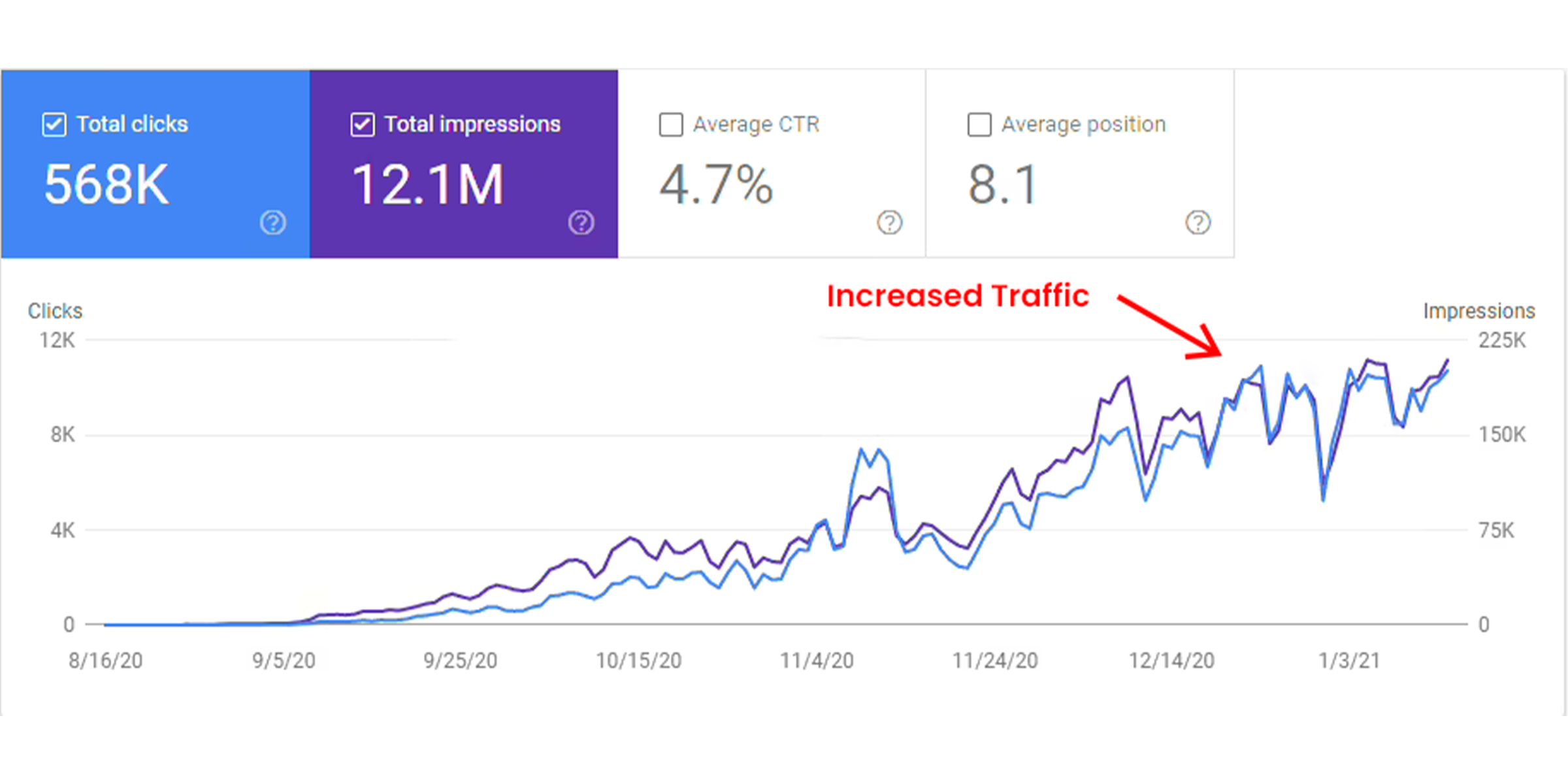
The image below shows how optimizing a website in terms of responsiveness can help boost site traffic as it helps the audience view site perfectly.
Mobile usage is continuously growing every month, which means more & more potential customers will view your site from mobile devices. If their experience of viewing & interacting with your site is not good, they’ll be more likely to visit your competitor’s site.
2- Google Prioritize Mobile-First Websites
Wondering— what are the major factors of SERP’s higher ranking?
A responsive website is one of them… See what Google recommends.
There’s no secret that Google has moved toward a “mobile-first” approach in recent years. For indexing and ranking, Google primarily uses the mobile version of the content the smartphone agent indexed. Mobile-first indexing is the term used for this.
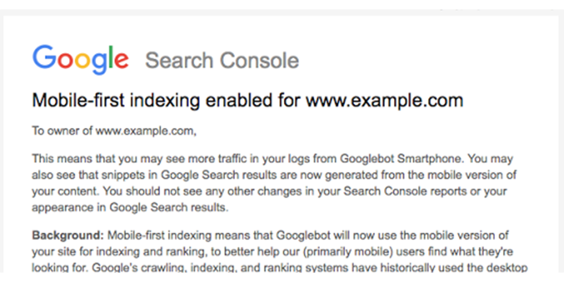
Google recommends Responsive Web Design as it aims to provide valuable & accessible content to users. When a site is responsive and user-friendly, the algorithm is more likely to rank it highly.
Google favors websites optimized for mobile devices and have adopted a mobile responsive web design. Moreover, it’s the easiest design pattern to implement and maintain.
If you haven’t already, create a mobile-friendly site so your targeted users visiting your site through a mobile phone can have a good experience.
3- Cost-Effective & Lower Maintenance Needs
Making a responsive website takes less time than a stand-alone mobile application and a standard desktop website.
Even if the starting investment of a responsively designed website is more expensive than creating two separate websites, you’ll save in the long term due to the special configuration costs of a website that uses two separate website versions.
Moreover, responsive design’s “one size fits all” technique means less headache for web developers, business owners, & consumers. Spending less time on maintenance also helps you focus on more crucial things like marketing and content creation techniques.
4- Responsive Sites Improve SEO Ranking
Marketing your business is crucial for you to be found in front of an audience and SEO is one of the top ways to drive more traffic to your website.
Responsive site development is Google’s recommended approach for mobile web design. As per Google, responsive websites will perform better in search rankings because they provide a better user experience than sites that are not mobile-friendly.
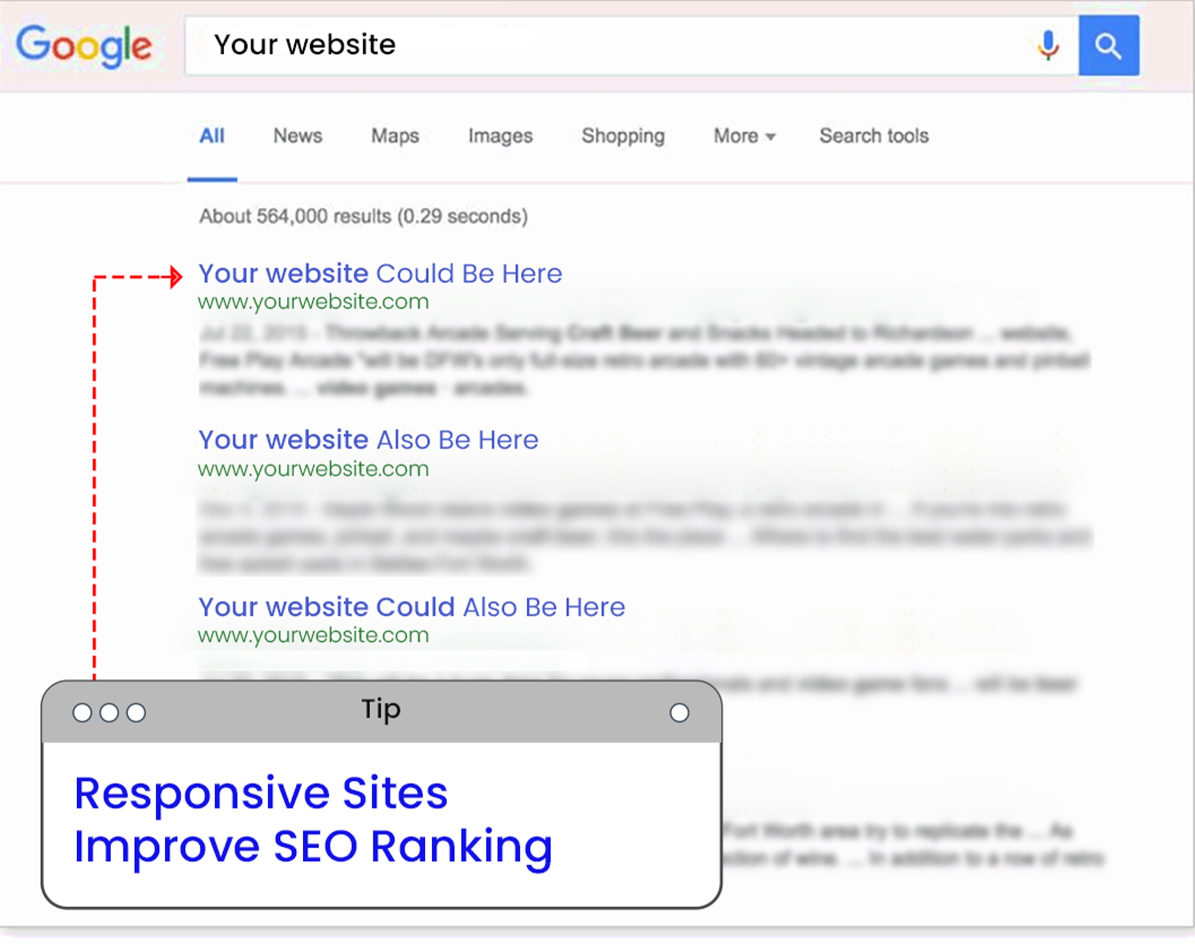
Instead of having separate desktop and mobile versions, you can avoid the problem of duplicate content, which can negatively impact your search ranking, by using a single responsive website. Google likes that responsive sites use single URLs vs. different URLs for separate mobile versions of websites.
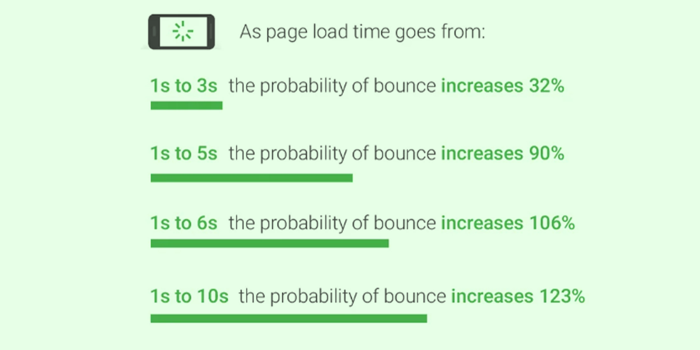
5- Improve Page Speed Performance
Page speed is another element that significantly impacts your SEO rankings. Mobile users’ attention spans are limited. According to studies, mobile users leave websites that take longer than three seconds to load fully.
Here’s the Google tool– Page Speed Insight. You can check every crucial detail regarding website page speed 7 and what elements need to optimize.
If a website isn’t optimized for smartphones, it will also take more time to navigate, frustrating customers to the point of no return. Optimize your page speed for more traffic and conversions on your website.
Ensure your responsive site uses modern performance techniques such as caching, and responsive image display that will help you improve your web page loading speed. Mobile responsive websites load faster on both mobile and desktop devices.
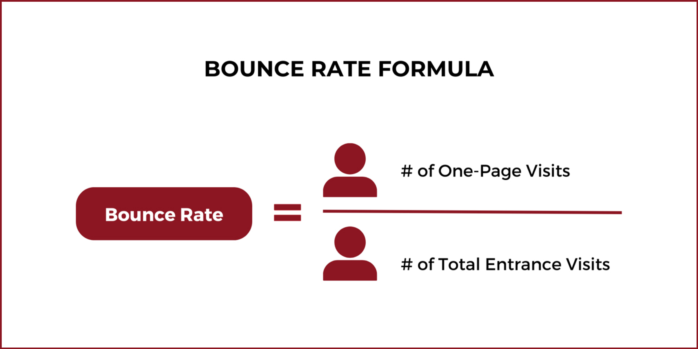
6- Reduce Bounce Rate
Bounce rate refers to how quickly users visit and then immediately leave your website. This metric can indicate whether your site satisfies the user’s search.
A responsive & optimized mobile site provides a much better UX for the visitor. Therefore, it’s much more likely that they’ll stick to your site for a longer period and explore different pages of your site. Here’s a formula below for the bounce rate, which you can measure……
Your content may be fantastic, but if your web design makes it difficult for users to navigate the site, users will drop off and look for information elsewhere. A high bounce rate may also hint that your website didn’t load quickly or didn’t provide the positive experience that users were looking for.
7- Increase Your Site’s Conversion Rate
Lowering your bounce rate is only half the battle. Converting new customers requires a consistent user experience across all devices.
If your potential customers visit your website via Instagram ads and decide to sign up for one of your services, they don’t want to be redirected to device-specific websites, as this type of conversion process is often time-consuming.
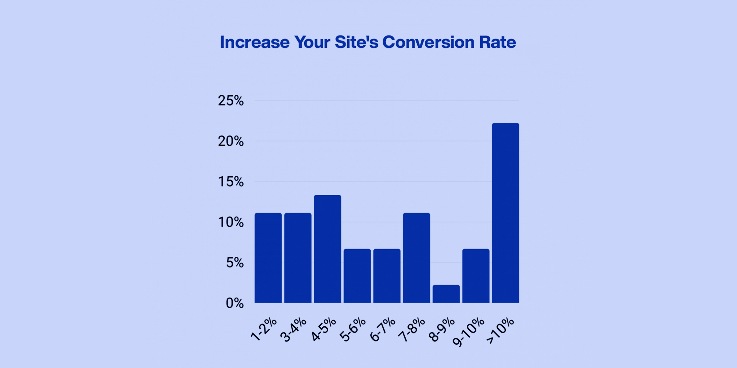
Having a single secure website that looks professional on all platforms makes users less likely to get frustrated or turn to a competitor.
8- Shopping On Mobile Devices Is Steadily Growing
According to Shopify, mobile commerce is expected to reach $620.97 billion by 2024. Nearly half (42.9%) of all ecommerce purchases will be made via a mobile device.
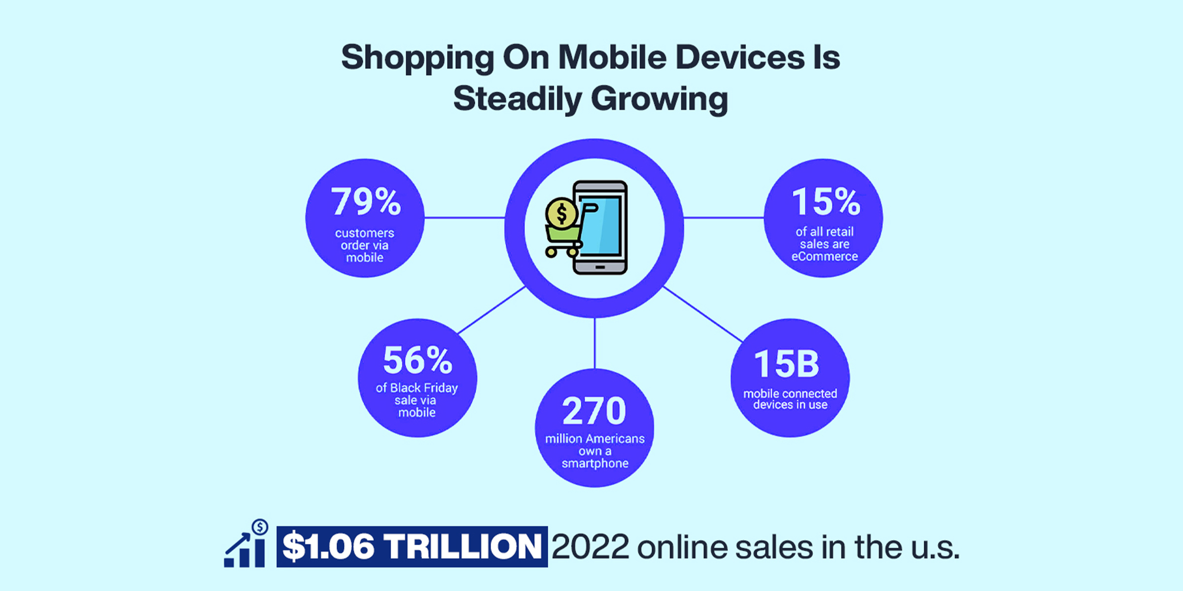
Online shopping is easier than hopping in the car and driving to the store, and it is even easier if you can do it in your favorite chair while watching TV. You’re missing out on a huuuuuuuuge opportunity— If your products and services aren’t easy to view from a phone.
When users like your content, they’re more likely to share it with friends, even famous influencers can collaborate with you if your website provides a top-notch user experience with better products & services.
A responsive website makes it easy for users to engage with your site, thoroughly enjoy your content, and then share it on social media. Many RWD designers build sites with social sharing capabilities to make it easy for users to share your content far and wide. Social shares don’t directly impact rankings but help you grow your online reputation among your target audiences.

More social traffic means more users visiting your site, which could mean even more customers or subscribers for your business. With easy-to-use social share buttons, your mobile-ready site will encourage users to share your content, reaching a much wider audience.
10- Easier analytics reporting
Knowing where the traffic is coming from and how users are interacting with your site is essential to make improvements. And managing multiple website versions requires developers to track users’ journeys through different conversion funnels, paths, and redirects.
Having a single responsive website greatly simplifies the monitoring & optimizing process.
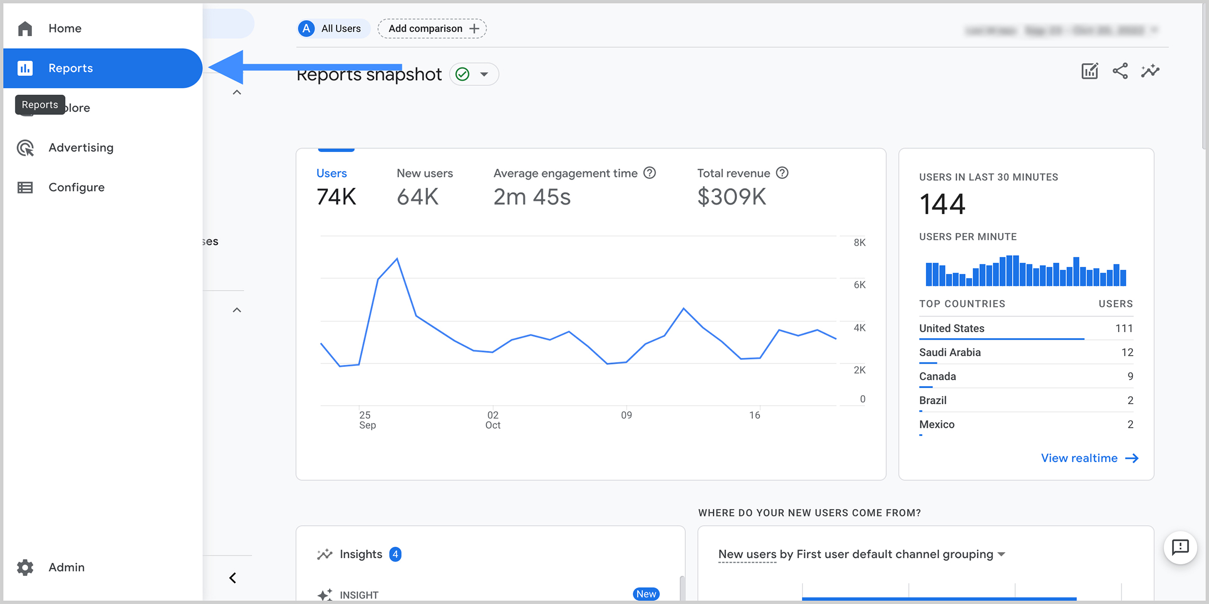
With Google Analytics and other tools created specifically for responsive websites, you can combine tracking and analytics into a single report to see how your content performs across various devices. Moreover, allows you to see how many people visit your website, attract new customers, where they are coming from, how long they stay on your website, what browsers they use, what pages they visit, & so much more.
11- More Visitors and Sales
Having a top-notch mobile-friendly website and satisfying user experience will keep the visitors coming and give them more reasons to stick around.
Furthermore, the trend of online shopping is consistently growing. If your website is optimized to meet their needs and provide hassle-free mobile experiences, they will likely purchase and return for more.
A responsive website can boost your sales and make your content shareable, thus bringing even more potential customers.
How does responsive web design work?
Responsive web design works through CSS (Cascading Style Sheets), using various settings to serve different style properties depending on the screen size, resolution, orientation, color capability, viewport, media queries, and other user device characteristics.
Is your website responsive?
You can quickly see whether a website is responsive in your web browser. How to check for a responsive web design
- Go to Google Chrome
- Enter your site domain
- Press Ctrl + Shift + I to inspect or open Chrome DevTools
- Press Ctrl + Shift + M to see the device toolbar.
- View your page from a desktop, mobile or tablet perspective.
You can also use a free tool, like Google’s Mobile-Friendly Test, to see if pages on your website are mobile-friendly. While you can achieve mobile-friendliness with other design approaches, such as adaptive design, responsive web design is the most common because of its advantages.
To Sum Up
Responsive design allows your website content to flow freely across all screen resolutions and sizes, rendering it look great on all devices. It also makes it unnecessary to maintain different versions of your website for mobile and desktop and saves you time, resources and effort.
A modern-looking, mobile-friendly, and fast website is a prerequisite to growing your business and attracting new customers. It makes your online presence more solid and shows you as more trustworthy to your customers.
Of course, having a great-looking and well-optimized website is only the beginning. To make it count, you must still fill it with valuable content and provide top-notch products and services. But a website is the digital face of your business and making it friendly, accessible, and flexible is a basis you shouldn’t go without. Need help in developing responsive websites & growing more site traffic & sales? Reach out to our professional web developers now & grow your brand to the next level.
Visit our blog section now to get more tips & information for your business ranking, branding, and marketing. There you’ll find a lot of useful tried & tested advice and insights into different areas of the online world – from SEO to content marketing to ecommerce success to web design & more. Check out our blogs, or get in touch for expert advice.
Go Responsive Now!