
Synopsis Learn how to design and build responsive websites that look great on any device. This guide will explain the basic techniques to create responsive websites, comparison between two of the most popular frameworks, Bootstrap vs. Tailwind CSS, and concepts such as mobile-first development, fluid layout, using media queries to adapt images and typography scaling. Throughout the guide, you will find practical code examples, tips on choosing which framework to use, suggestions for device testing, and methods of designing with Figma, along with common questions that people ask.
What is Responsive Web Design?
Responsive web design simply means creating websites that function optimally on any screen or device. So, whether a user is on a smartphone, tablet, laptop, or 4K desktop PC, the website’s content adjusts automatically. This ensures that users will be provided with the best possible viewing experience. Responsive web design allows developers to make one website that works on any device. It uses flexible layouts, images, and CSS media queries. The website’s content will automatically resize to fit any screen. This makes your website easy to read, access, and visually appealing to users.
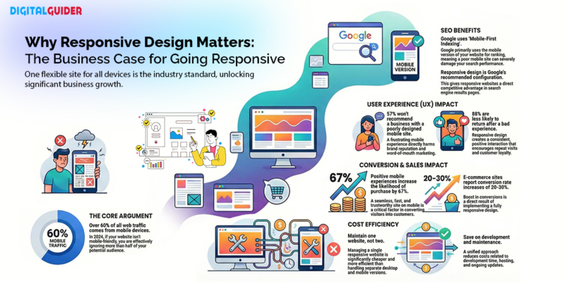
Why Responsive Design Matters (SEO, UX & Conversions)
Over 60% of web traffic comes from mobile devices. If your website isn’t responsive, you’re literally turning away more than half your potential audience. But the impact goes far beyond just mobile users.
- SEO Benefits: Google mainly looks at the mobile version of your site for searching and ranking. So, if your website architecture is not mobile-friendly, it can hurt your search rankings a lot. Moreover, Google has also stated that responsive design provides them with the best way to recommend site configurations and, therefore, gives sites that use a responsive design an overall advantage over other websites.
- User Experience: Users want to have an excellent user experience. As per studies conducted, 57% of users wouldn’t even recommend a business with a poor mobile site to their friends/family. In addition, 88% of online shoppers were recorded to be less likely to return to a site after having A negative experience during the sale of an item or service. Responsive Design will help you offer consistent positive experiences to your users throughout all devices.
- Conversion Impact: Mobile users who have a great user experience with your mobile site are 67% more likely to make a purchase. A responsive website also has a shorter loading time, A better navigation capability, and a feeling of trust—a key factor in converting users from visits to customers (the eCommerce sector has stated that conversion rates for these sites can increase by as much as 20% to 30% upon implementing responsive web design).
- Cost Efficiency: One responsive website can be managed A lot more cost-effectively than keeping separate Desktop versions and mobile versions of the same website. You will therefore save on the costs associated with:
- Development time
- Hosting costs
- Ongoing maintenance costs.
- Managerial time spent managing the site.
- Marketing costs associated with promoting two separate versions of your website.
Why Responsive Design Matters (SEO, UX & Conversions)
Responsive Web Design Frameworks
| Framework | File Size | Grid System | Breakpoints | JavaScript Required | Best For |
| Bootstrap | 189KB minified | 12-column Flexbox | xs (<576px), sm (≥576px), md (≥768px), lg (≥992px), xl (≥1200px), xxl (≥1400px) | Optional (for components) | Rapid prototyping, enterprise apps, and comprehensive projects |
| Tailwind CSS | <10KB (purged) | Utility-Based Grid | sm (640px), md (768px), lg (1024px), xl (1280px), 2xl (1536px) | No (build process needed) | Custom designs, modern frameworks (React/Vue), complete design control |
| Foundation | ~150KB | XY Grid / Float Grid | small (0-639px), medium (640-1023px), large (1024-1199px), xlarge (1200-1439px), xxlarge (≥1440px) | Optional | Enterprise applications, accessibility-focused projects, and email templates |
| Pure CSS | 3.7KB gzipped | Fractional units | sm (≥568px), md (≥768px), lg (≥1024px), xl (≥1280px) | No | Performance-critical projects, simple websites, minimal overhead |
| Semantic UI | 280KB+ | Stackable Grid | mobile (<768px), tablet (768-991px), computer (992-1199px), large (1200-1919px), widescreen (≥1920px) | Yes (jQuery) | Beautiful defaults, readable code, rich UI components |
| jQuery Mobile | ~100KB | Basic responsive | Single mobile-first breakpoint | Yes (jQuery) | Legacy projects, older device support, touch-optimised apps |
| Materialize CSS | 210KB+ | 12-column Grid | s (≤600px), m (601-992px), l (993-1200px), xl (>1200px) | Yes (jQuery) | Material Design projects, Android-companion apps, card-based layouts |
| Bulma | ~200KB | Flexbox columns | mobile (<769px), tablet (≥769px), desktop (≥1024px), widescreen (≥1216px), fullhd (≥1408px) | No | Modern web apps, Vue.js/React projects, CSS-only preference |
| Skeleton | 11KB | 12-column basic | mobile (<550px), desktop (≥550px) | No | Small projects, landing pages, learning responsive basics |
| UIKit | ~120KB | Flexbox Grid | s (<640px), m (640-959px), l (960-1199px), xl (≥1200px) | Yes (minimal) | Content-heavy sites, portfolios, WordPress themes |
| Milligram | 2KB gzipped | Flexbox Grid | mobile (<40rem/640px), desktop (≥40rem) | No | Minimalist projects, performance-critical apps, simple sites |
Detailed Framework Features
| Framework | Key Components | Customization | Learning Curve | Community Size | Active Development | Code Example |
| Bootstrap | Navbar, Cards, Modals, Carousels, Forms, Buttons, Alerts, Badges | Sass variables, theme customisation | Moderate | Very Large (27% of websites) | Very Active | <div class=”row”> <div class=”col-12 col-md-6 col-lg-4″>Column</div> </div> |
| Tailwind CSS | Utility classes only (build your own) | Highly customizable via config file | Steep initially | Large & Growing | Very Active | <div class=”grid grid-cols-1 md:grid-cols-2 lg:grid-cols-3 gap-4″> <div>Column</div> </div> |
| Foundation | Navigation, Cards, Orbit, Reveal, Abide, Motion UI | Sass variables, extensive options | Steep | Medium | Active | <div class=”grid-x grid-margin-x”> <div class=”cell small-12 medium-6 large-4″>Column</div> </div> |
| Pure CSS | Grids, Forms, Buttons, Tables, Menus | Limited (add custom CSS) | Easy | Small | Minimal updates | <div class=”pure-g”> <div class=”pure-u-1 pure-u-md-1-2 pure-u-lg-1-3″>Column</div> </div> |
| Semantic UI | 50+ components: Calendar, Dropdown, Progress, Rating | 3,000+ theming variables | Moderate | Medium | Slowing down | <div class=”ui stackable three column grid”> <div class=”column”>Column</div> </div> |
| jQuery Mobile | Touch widgets, Listviews, Panels, Popups | Theme roller | Easy | Small (declining) | Maintenance mode | <div class=”ui-grid-b”> <div class=”ui-block-a”>Column 1</div> <div class=”ui-block-b”>Column 2</div> <div class=”ui-block-c”>Column 3</div> </div> |
| Materialize CSS | Cards, Chips, Modals, Parallax, Waves effects | Colour palette, Sass variables | Easy to Moderate | Medium | Active | <div class=”row”> <div class=”col s12 m6 l4″>Column</div> </div> |
| Bulma | Navbar, Cards, Modal, Tabs, Panels | Sass variables, modular imports | Easy | Growing | Very Active | <div class=”columns is-mobile”> <div class=”column is-12-mobile is-6-tablet is-4-desktop”>Column</div> </div> |
| Skeleton | Basic typography, forms, buttons | Easy (minimal code) | Very Easy | Small | Not maintained | <div class=”container”> <div class=”six columns”>Half width</div> </div> |
| UIKit | Slideshow, Lightbox, Parallax, Sticky, Offcanvas | Visual customizer, Less/Sass | Moderate | Small to Medium | Active | <div class=”uk-grid-small uk-child-width-1-3@m” uk-grid> <div>Column</div> </div> |
| Milligram | Typography, forms, buttons, lists, tables | Minimal (extend with CSS) | Very Easy | Small | Moderate | <div class=”container”> <div class=”row”><div class=”column”>Column</div></div> </div> |
Website-Responsiveness on All Screen Sizes
- Mobile Viewport (320px – 480px): Mobile testing is important because most users will access your site via a mobile device. Also, ensure that a hamburger menu is available for navigation. The font should be easily read without having to zoom in, and buttons should be large enough for finger tapping (at least 44 x 44 pixels). Forms should be easy to fill out.
- Tablet Viewport (481px – 768px): Tablet devices straddle the line between mobile devices and desktop computers. As such, content may be laid out in two columns as opposed to one on mobile or three on a desktop. Make sure images do not stretch awkwardly, and that navigation works in both portrait and landscape orientations.
- Laptop Viewport (769px – 1024px): This is normally considered to be the default design size and therefore verify that your complete navigation is visible, your multi-column layouts are functioning properly, and that you are not using excessive white space.
- Desktop Viewport (1025px – 1200px): When viewing a site on a standard desktop monitor, you should be able to view the entire site as it was designed to be seen, with properly aligned content in the centre or to either the right or left of the screen rather than stretched edge-to-edge across a wide monitor.
- Large Displays and 4K (1201px +): When using ultra-wide monitors and/or 4K monitors, special attention should be paid to the way that you display your website. To help ensure that the text remains readable and not overly stretched across the screen, use a container with a maximum width of 1200-1400 pixels.
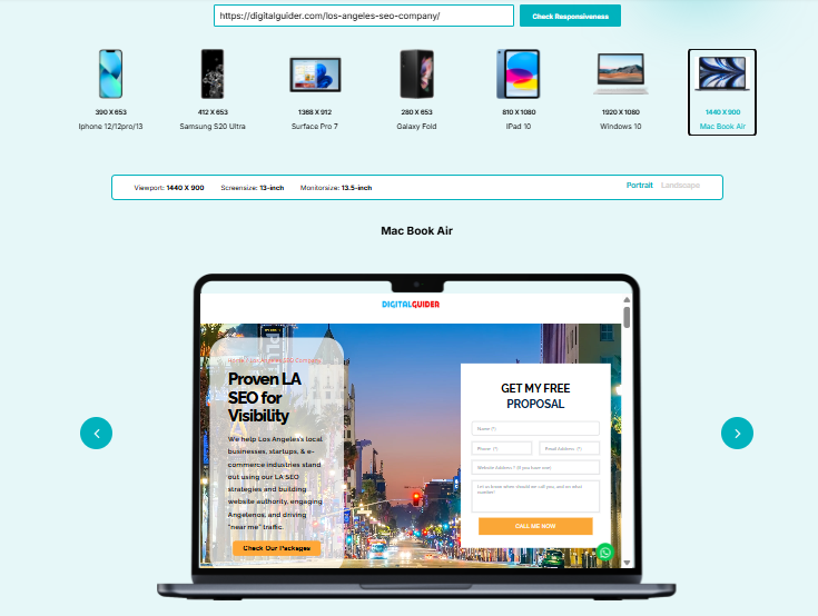
Tools to Test Responsive Design Across Devices?
- Chrome DevTools: Built-in device emulation with preset device sizes
- BrowserStack: Cloud-based testing on real devices and browsers
- Figma Preview: Test designs before development
- Responsive Design Checker: Quick online tool for multiple viewports
- LambdaTest: Cross-browser testing platform
- Lighthouse from Chrome: an open-source, automated tool for improving the quality of web pages.
Common Screen Sizes For Responsive Design
- Mobile: 360 x 640
- Mobile: 375 x 667
- Mobile: 360 x 720
- iPhone X: 375 x 812
- Pixel 2: 411 x 731
- Tablet: 768 x 1024
- Laptop: 1366 x 768
- High-res laptop or desktop: 1920 x 1080

breakpoints & media query
- Why Real Device Testing Matters
Testing a website directly on real physical devices allows for more accurate testing than emulating the device environment. For example, emulated devices do not accurately reflect touch interaction, load speed performance, or the way content appears on an actual device screen. To ensure all testing is complete, you should conduct testing on at least one iOS device and one Android device and multiple browsers such as Chrome, Safari, Firefox, and Edge.
Core Building Blocks of Responsive Website Design
| Component | What it does | Why it matters | Visual example idea |
| Viewport Settings | Tells the browser to match the screen’s width and set initial zoom to 100% using <meta name=”viewport” content=”width=device-width, initial-scale=1.0″> | Without it, mobile browsers render pages at desktop widths and scale them down, creating tiny, unreadable text | Side-by-side comparison: mobile page without viewport (zoomed out, tiny text) vs. with viewport (properly sized, readable) |
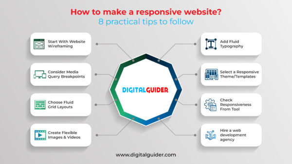
| Fluid Grids & Flexible Layouts | Uses relative units (percentages) instead of fixed pixels to create layouts that resize proportionally (e.g., three columns at 33.33% each instead of 300px each) | Fixed-width layouts break on smaller screens; fluid grids automatically adjust to any screen width while maintaining proportional relationships | Animation showing three columns: fixed 300px columns breaking/overflowing on mobile vs. 33.33% columns adapting smoothly |
| Media Queries & Breakpoints | CSS rules that apply different styles based on device characteristics (screen width). Target ranges:
| Acts as the “brain” of responsive design, telling your site how to rearrange content at different screen sizes | Diagram showing a website layout transforming at each breakpoint: 3-column desktop, → 2-column tablet, → 1-column mobile |
| Responsive Images & Videos | Uses max-width: 100% CSS rule and modern techniques like srcset and <picture> elements to scale media and serve appropriately sized files based on screen resolution | Prevents images from breaking layouts and avoids loading unnecessarily large files on mobile devices, improving performance | Before/after: oversized image breaking mobile layout vs. properly scaled image fitting container; file size comparison (2MB desktop vs. 200KB mobile) |
| Responsive Typography | Uses relative units (rem, em, vw) and techniques like clamp() to scale text appropriately across devices (e.g., headings: 48px desktop → 28px mobile) | Text readable on desktop can be microscopic on mobile; responsive typography maintains hierarchy while ensuring readability on all devices. | Typography scale visualisation: same heading shown at desktop size (48px, comfortable) vs. mobile size (28px, still readable and proportional) |
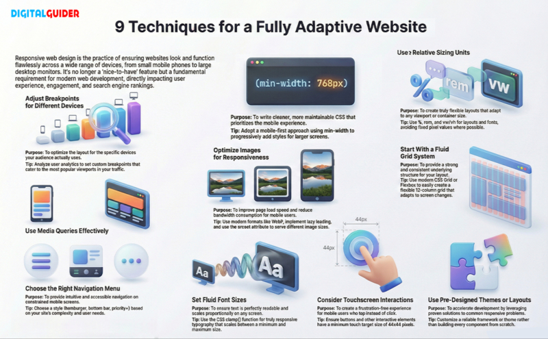
Responsive Web Design Techniques for a Fully Adaptive Website
- Adjust Breakpoints for Different Devices: Use your analytics to determine the types of devices that visitors will use to view your site. If 40% of your web traffic comes from an iPhone 12, adjust your design for its viewport resolution. Make it one of your breakpoints.
- Use Media Queries Effectively: When creating media queries, reverse the procedure by utilising min-width instead of max-width to build a stylesheet. Using a mobile-first approach for media queries will give you cleaner code. This makes maintenance easier. You won’t need to change styles for tablets and desktops.
- Choose the Right Navigation Menu Style: Mobile Navigation is extremely important, and there are many different styles to choose from. One of the most common styles is a hamburger menu. Developers often use bottom navigation bars in mobile applications. Priority navigation lets you display all the important items at once. You can hide the rest until you need them. Choose how to set your navigation menus based on your site content structures. Hope this helps.
- Optimise Images for Responsiveness: Use modern image formats like WebP and AVIF. Implement lazy loading to boost speed and performance. Use different image sizes with srcset. Ex: A mobile phone would download a 2000px wide image, which would waste a lot of bandwidth and take a long time to load.
- Set Fluid Font Sizes for Smaller Screens
- Use clamp() for truly responsive typography:
- font-size: clamp(1rem, 2.5vw, 2rem);
- This sets a minimum of 1rem, a maximum of 2rem, and scales with viewport width in between.
- Use Fixed or Relative Sizing (%, REM, EM, VW, VH): Using percentages for width is helpful. REM units are good for font size. Viewport units work well for full-page sections. This approach gives you a lot of flexibility when designing your website. Use Fixed Pixel Values only on occasion to define things like borders, etc.
- Consider Touchscreen Interactions: Mobile devices are generally taps, not clicks. Make sure there is enough space between clickable elements. All interactive elements should be at least 44px by 44px. You could also consider integrating touch gestures, swipe etc., into carousels.
- Start With a Fluid Grid System: A grid system essentially arranges your content uniformly. The 12-column layout is a standard grid system. However, it is now easier to create a fluid grid layout using CSS Grid and Flexbox.
- Use Pre-Designed Themes or Layouts: There is no need to start from scratch when developing your themes/templates. Most frameworks have already addressed the common issues you will encounter when creating responsive layouts. Instead, take an existing pre-built theme/template and modify the elements to meet your needs.
9 Techniques for Adaptive Websites
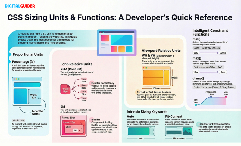
CSS Units and Values for Reactive Web Design
- Percentage (%): Perfect for creating proportional layouts and adjusting widths. Width: 50% always takes half the parent container, regardless of screen size.
- REM & EM: REM (root em) is relative to the root font size, making it ideal for consistent spacing and typography. EM is relative to the parent element’s font size, useful for component-based scaling.
- VW & VH: Viewport width (vw) and viewport height (vh) are percentages of the browser window. 100vw equals the full width of the viewport, perfect for full-screen sections.
- Min(), Max(), Clamp():
These CSS functions provide intelligent constraints:- min() chooses the smallest value
- max() chooses the largest value
- clamp() sets a minimum, preferred, and maximum value
- Auto & Fit-content: Auto lets the browser calculate optimal sizing, while fit-content sizes elements based on their content, both essential for flexible layouts.
CSS Units and Values
Easiest Way to Make a Website Responsive (Step-by-Step Guide)
- Step 1: Set the Right Breakpoints: The target devices of your audience should be studied; you should define between 3 and 5 breakpoints for your design (we suggest Mobile: 320px, Tablet: 768px, and Desktop: 1024px as a start).
- Step 2: Build With a Fluid Grid Layout: Use a 12-column fluid grid using CSS GRID or FLEXBOX. This allows for the column grid structure and for content to flow from column to column based on breakpoints.
- Step 3: Ensure Touchscreen-Friendly UI: Increase the size of buttons, space out all interactive elements, and ensure that you test every interaction with your finger rather than just your mouse when testing your designs.
- Step 4: Define Scalable Typography: Define a base font size of at least 16px; all typography should be defined in rem units and must be designed responsively by using clamp() or media queries.
- Step 5: Use Pre-Made Themes/Templates (If Needed): If starting with your layout seems overwhelming, use a responsive theme as a starting point and customise it to fit your design. This will speed up your development and make sure you are using current responsive best practices.
- Step 6: Test on Real Devices and Browsers: Although browser DevTools are useful for testing, nothing is more effective than testing your design on an actual device. Borrow someone else’s phones or tablets, or utilise device labs to test that your design works as intended.
Responsive Website Themes/Templates
Using a theme or pre-designed layout with responsive properties is an excellent option for developers and designers with exceptionally tight deadlines. Here, WordPress offers a variety of options in this area (both free and paid). After selecting a theme, all that remains for designers to do is customize the website content, images, and color, as per the project needs.
There are many options for choosing predefined themes/layouts, like WordPress themes, for selecting the ideal design for your website.
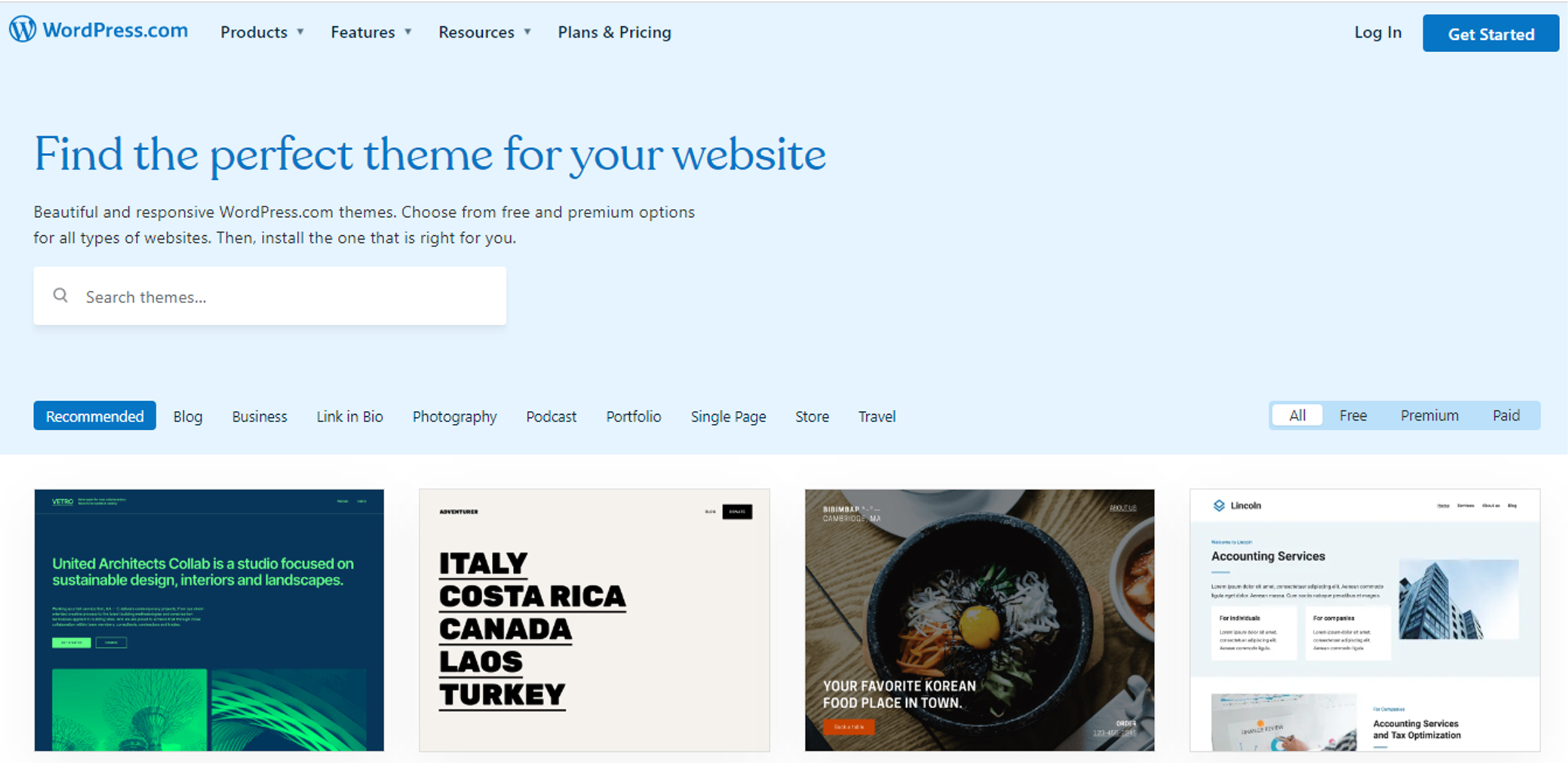
wordpress responsive themes
Many themes are available, both free and paid, that are responsive. You just have to make a few tweaks here and there to design your website.
Wrapping Up
There is now no choice but to develop websites responsively. With fluid grids, flexible images, media queries, and responsive typography built into your website, you can create a website that looks good on all devices. Start with mobile-first design, utilise the latest CSS techniques, use frameworks as needed, and always test on physical devices.
Your investment in responsive design will pay off with increased SEO rankings, better user experience, and higher conversion rates. Users today expect responsive websites, Google rewards companies that provide them, and businesses today rely on responsive websites. Digital Guider’s web development team can help make your website responsive. Contact us today for a free, no-obligation quote.
Responsive Web Design FAQs
1. How does responsive design affect SEO?
Ans: Search engine optimisation (SEO) benefits a great deal from responsive web design. When a website is indexed by Google, they use mobile-first indexing, meaning it will rank mobile-friendly websites higher than those that aren’t. With responsive web design, there will only be a single URL for each responsive page, which means all of the links to that page will have link equity combined into one single page, eliminating the issue of duplicate content. Additionally, responsive web design creates a lower bounce rate due to a better page speed and user experience; both of these factors have been confirmed as factors influencing Google Rankings.
2. What are the essential components of responsive design?
Ans: Five key elements working together to create flexible layouts for mobile devices. The five elements are the viewport meta tag (controls page size), fluid grids (the use of percentages to determine grid proportions), media queries (CSS layout rules for different screen sizes), flexible images (the use of max-width: 100% to scale images according to their surrounding containers), and responsive typography (the use of rem and em units to allow font sizes to be scalable).
3. How to Make a Website Responsive for All Devices?
Ans: Use a viewport metatag, design your fluid grids with CSS Grid/Flexbox, implement media queries for your breakpoints (mobile, tablet, desktop), ensure that your images are maximized to a responsive max width of 100%, use relative units such as: rems, percent (%) and view width (vw) instead of pixels, optimize your navigation for mobile devices and thoroughly test it using Chrome DevTools or any other testing tools available.
4. How to Use Bootstrap for a Responsive Website
Ans: Utilise Bootstrap CSS/JS from a CDN and build out the full 12-column grid system using the various responsive classes (i.e., col-sm-, col-md-, col-lg-). Add responsive utilities to your layouts to hide certain elements only on small devices (i.e., d-none, d-md-block), add any required components to your layout (i.e., navbar, card), and make sure you use all six of Bootstrap’s responsive breakpoints to define how your layout will behave at various screen sizes.
5. Which framework is commonly used for responsive web design?
Ans: Bootstrap is a widely used framework accounting for 27% of current Internet websites, with a complete, well-documented set of components and classes available. Tailwind CSS is the fastest-growing framework for creating custom designs. Foundation is intended for enterprise-level projects. Materialise CSS employs the Material Design guidelines, while Bulma may be used as pure CSS without requiring JavaScript. Your project type will determine which framework is appropriate; Bootstrap may be used for general website development, Tailwind may be used for highly customizable designs, and Foundation is appropriate for enterprise applications.
6. Can we make a responsive website using Figma for all screen sizes?
Ans: While Figma is an excellent tool for creating responsive websites, it is still a design application. In Figma, you can create different frames for different-sized devices (mobile, tablet, desktop), employ Auto Layout to create flexible components, apply constraints to define how elements behave, create a grid system for layout, and install responsive design plugins. However, developers will still need to convert the designs created in Figma into HTML/CSS code that will allow them to build actual responsive sites.
7. What is the difference between mobile-first & responsive design?
Ans: Mobile-first is an approach to implementing responsive design (not a stand-alone approach). Responsive design is the method of adapting to all screens regardless of size; mobile-first, then starting from mobile and then progressively enhancing for larger devices through the use of min-width media queries. This approach ensures that you are placing the most critical content at the top, can improve performance, and create cleaner code than the traditional desktop-first method.
8. Which is better for small businesses — responsive website templates vs custom design?
Ans: Most small businesses utilise templates, which typically cost $30 to $200, as compared to custom websites ranging from $3,000-$15,000. You can typically launch within weeks using template layouts versus months with custom websites. Templates generally come with a responsive design (tested) already integrated. You should only look into using custom designs if your company has the means of spending $10k or more on a design, or if you need unique functionality and/or brand differentiation.
9. How can I check if my website is responsive?
Ans: Chrome DevTools (F12, using device toggle mode) to simulate multiple device screen sizes, use the Google Mobile-Friendly Test to confirm compatibility with Google mobile-friendly criteria, and perform testing on actual mobile devices (i.e., iPhone, Android, and Tablets). Other ways of testing are via online tools such as Responsive Design Checker or BrowserStack. Ensure that all devices have no horizontal scrolling; I can read all text easily; buttons are easy to click on; and navigational elements work correctly on all devices.
10. What are the benefits of responsive web design?
Ans: Benefits: Better SEO (GoogleCarries mobile user friendly), more consistent user experience on all devices, higher conversion (67% more likely), Reduced Development Costs (1 site versus many websites), Easier Maintenance, Faster Loading Time, Lower Bounce Rates, Future -Proof Logging in, Brand Uniformity increased Mobile Traffic Capturing – crucial as over 60%+ of Web Traffic is from Mobile Devices.
11. What is the difference between responsive vs adaptive web design?
Ans: Responsive design utilises a single, fluid layout that continually adjusts to other screen sizes using flexible grids and CSS media queries. Adaptive design employs multiple (fixed) layouts, for example, to serve different types of screens, which typically use server-side detection of computing devices. In general, responsive designs require less effort to support different devices; they will function with any device type and are therefore recommended for most types of websites and online businesses, whereas adaptive designs provide greater control over user experiences but require ongoing support for multiple versions of those user experiences.
Share This Article
About the Author: Sofia Johnson
Related Articles
 June 15th, 2026 | 13 minutes read
Imagine you are an expert plumber in Toronto who knows how to fix a burst pipe even in the freezing
- June 8th, 2026 | 12 minutes read
Imagine you are running a coffee shop in Chicago. You know how to brew the best coffee in your neighborhood,
- June 1st, 2026 | 11 minutes read
TL, DR; People are now using AI tools like ChatGPT, Gemini, and Google AI to get direct answers online. ChatGPT
 May 25th, 2026 | 8 minutes read
List of Top 10 Digital Marketing Agencies in USA 1. DigitalGuider 2. WebFX 3. Disruptive Advertising 4. Ignite Visibility 5.


